
Branding Skapa Solutions
BACKGROUND
Skapa Solutions is an academic consulting firm providing customized training and advisory services in human-centered design, innovation, technology, and organizational strategy. Drawing on decades of academic and industry experience, the team works with organizations to identify opportunities, navigate complex challenges, and develop practical solutions tailored to their needs.
The name Skapa is rooted in the Nordic bind rune, which symbolizes creation, innovation, artistry, and the human capacity to bring new ideas and possibilities to life. The existing logo incorporated this symbolism by turning the Skapa rune on its side to create the impression of a key, representing discovery and the potential to unlock new ideas and solutions.
With an established concept already in place, the goal was to elevate and refine the existing mark, creating a more cohesive and sophisticated visual identity that better reflected the brand’s Nordic influence and forward-thinking approach.
Logo Concept Development
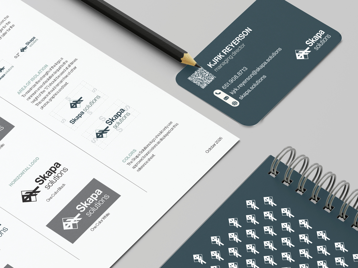
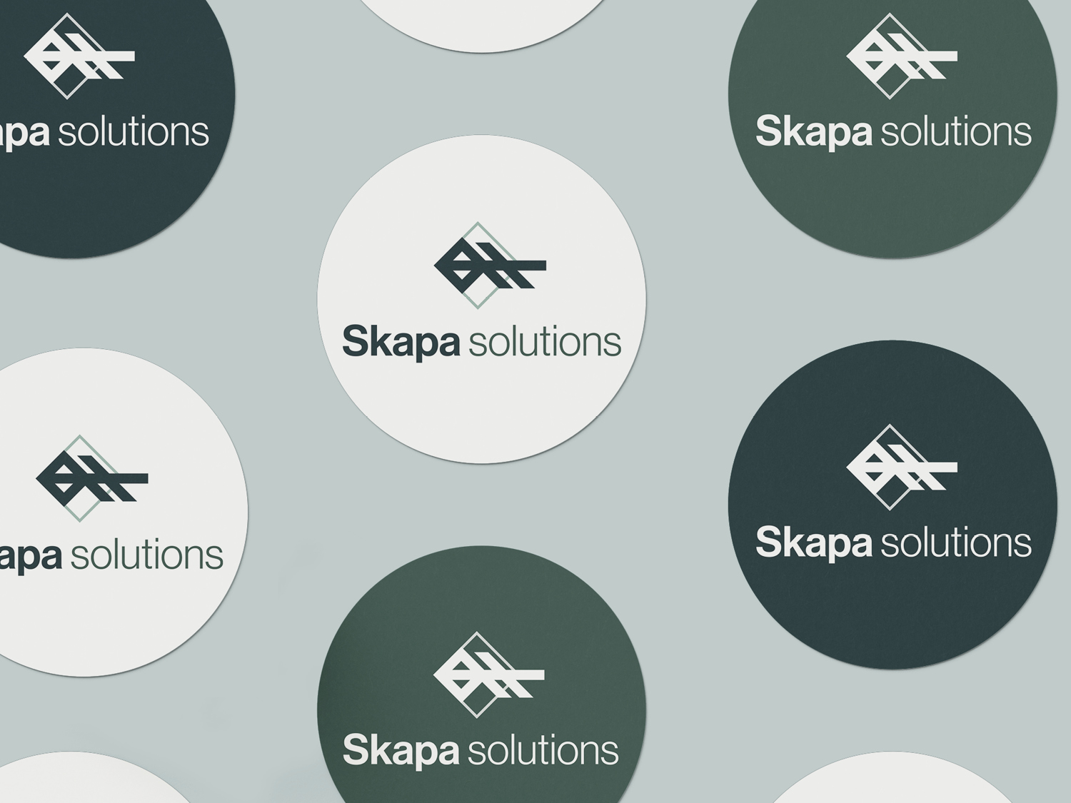
Building on the concept of a key and lock, the logo incorporates the Skapa bind rune as the key, integrating it directly into a geometric form. The overlapping shapes create a sense of discovery and connection, reflecting the process of uncovering ideas, making connections, and finding thoughtful solutions.
The resulting mark combines Nordic-inspired symbolism with clean, geometric construction to create a visual identity that feels both distinctive and timeless. Its simplicity and structure allow it to work across a variety of applications while maintaining a strong and recognizable presence.
Color Palette
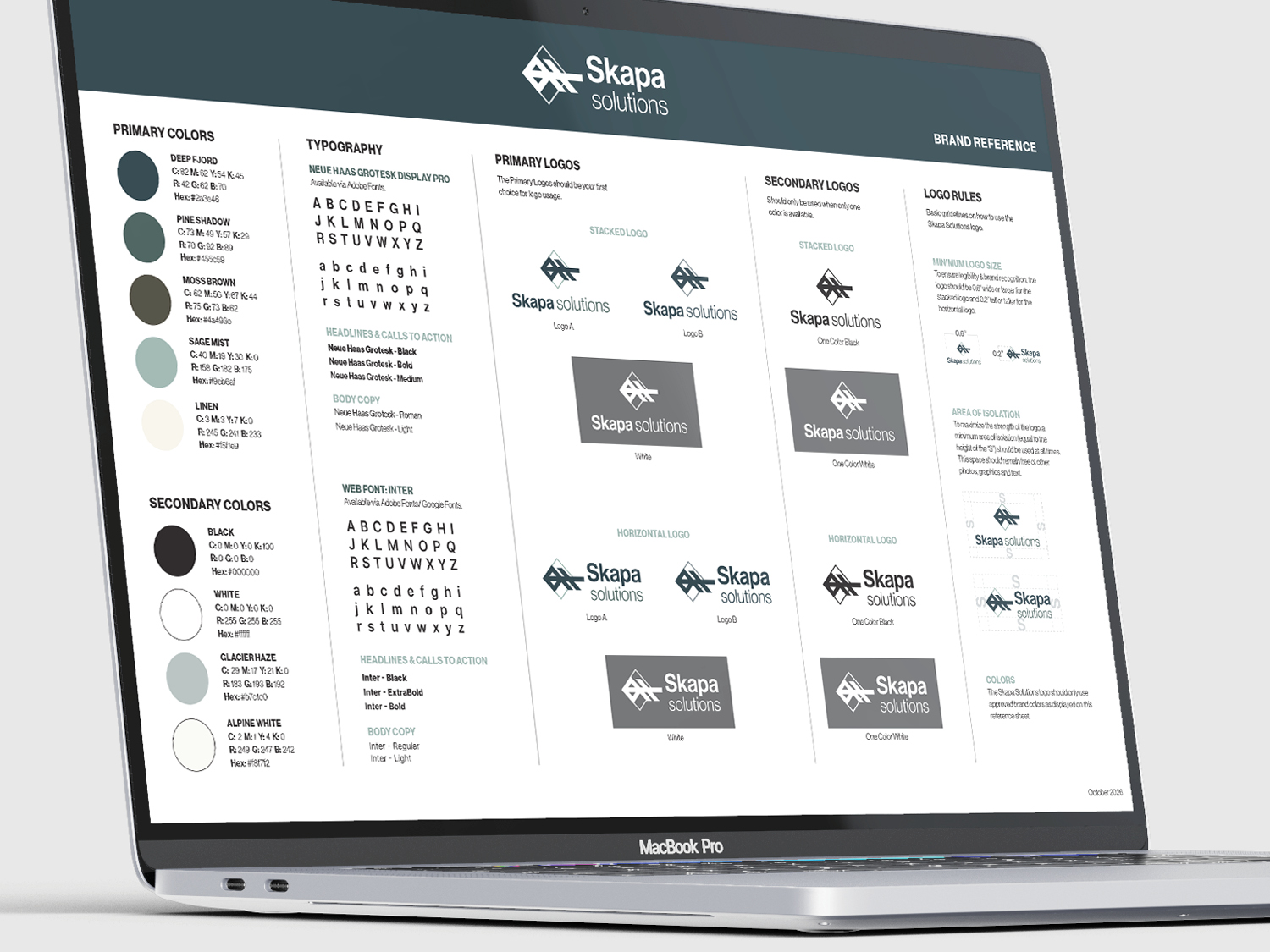
The color palette draws inspiration from natural, understated tones to establish a sense of sophistication, balance, and approachability. Deep charcoal and muted blues and greens provide a grounded foundation, while lighter sage and soft neutral tones introduce contrast and warmth.
Together, the colors create a refined, cohesive palette that feels modern without being overly technical or cold. Secondary neutrals, including black, white, and soft green gray, provide additional flexibility across print and digital applications.
TYPOGRAPHY
Neue Haas Grotesk Display Pro was selected as the primary typeface across brand applications. Its refined, modern sans serif forms complement the Nordic influence of the logo while bringing an intellectual and sophisticated quality to the overall identity.