branding REVIvAL CUSTOM HOMES
Background
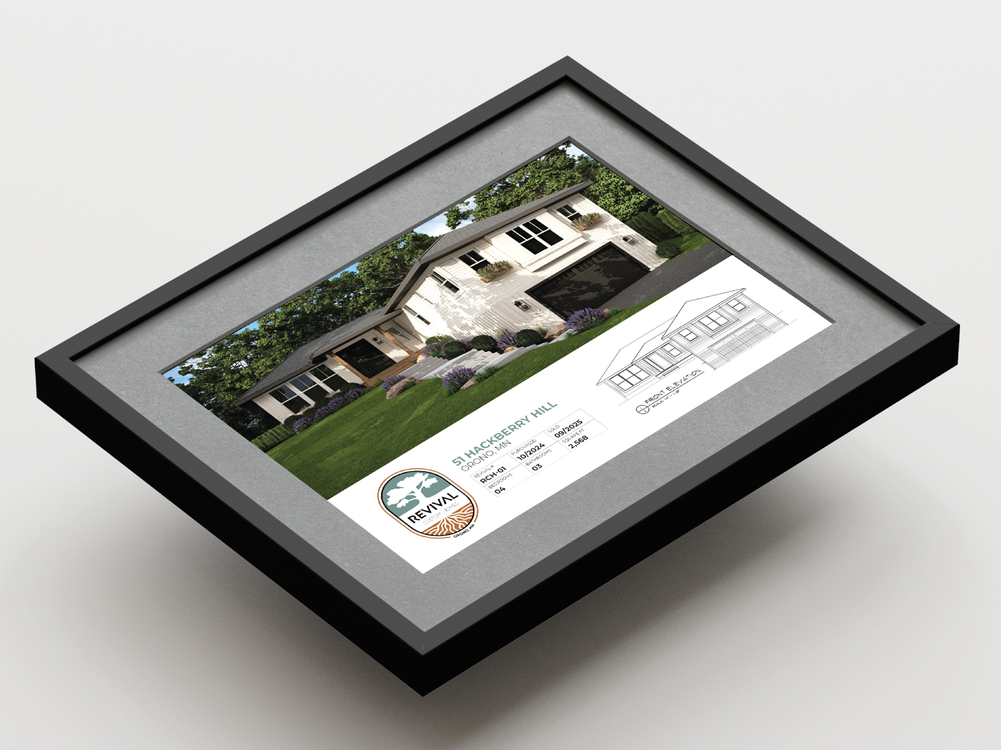
Revival Custom Homes is a new residential home builder rooted deeply in the Orono community. Focused on elevating the supply of high-quality, single-family homes, the company blends thoughtful design with a unique business model that maximizes the potential of high-value properties. The result: custom homes that offer greater value, distinctive character, and a sense of place unmatched by traditional new-construction options.
Logo Concept Development
The creative exploration centered on expressing Revival Custom Homes’ core narrative: a company rooted in legacy and committed to crafting spaces where families can thrive for generations. Early concepts explored symbols of resilience, renewal, and craftsmanship—ranging from abstract architectural forms to motifs inspired by nature.
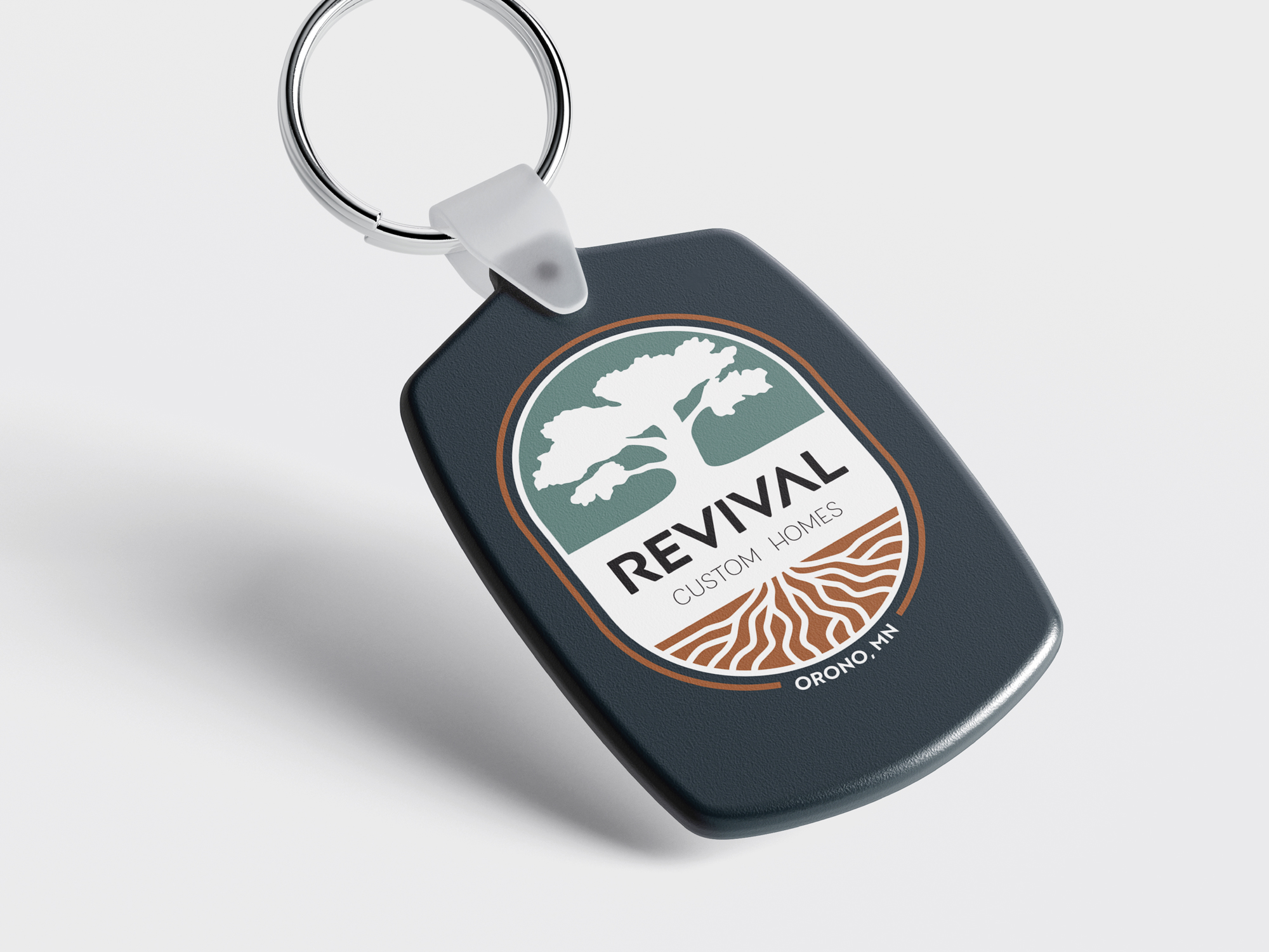
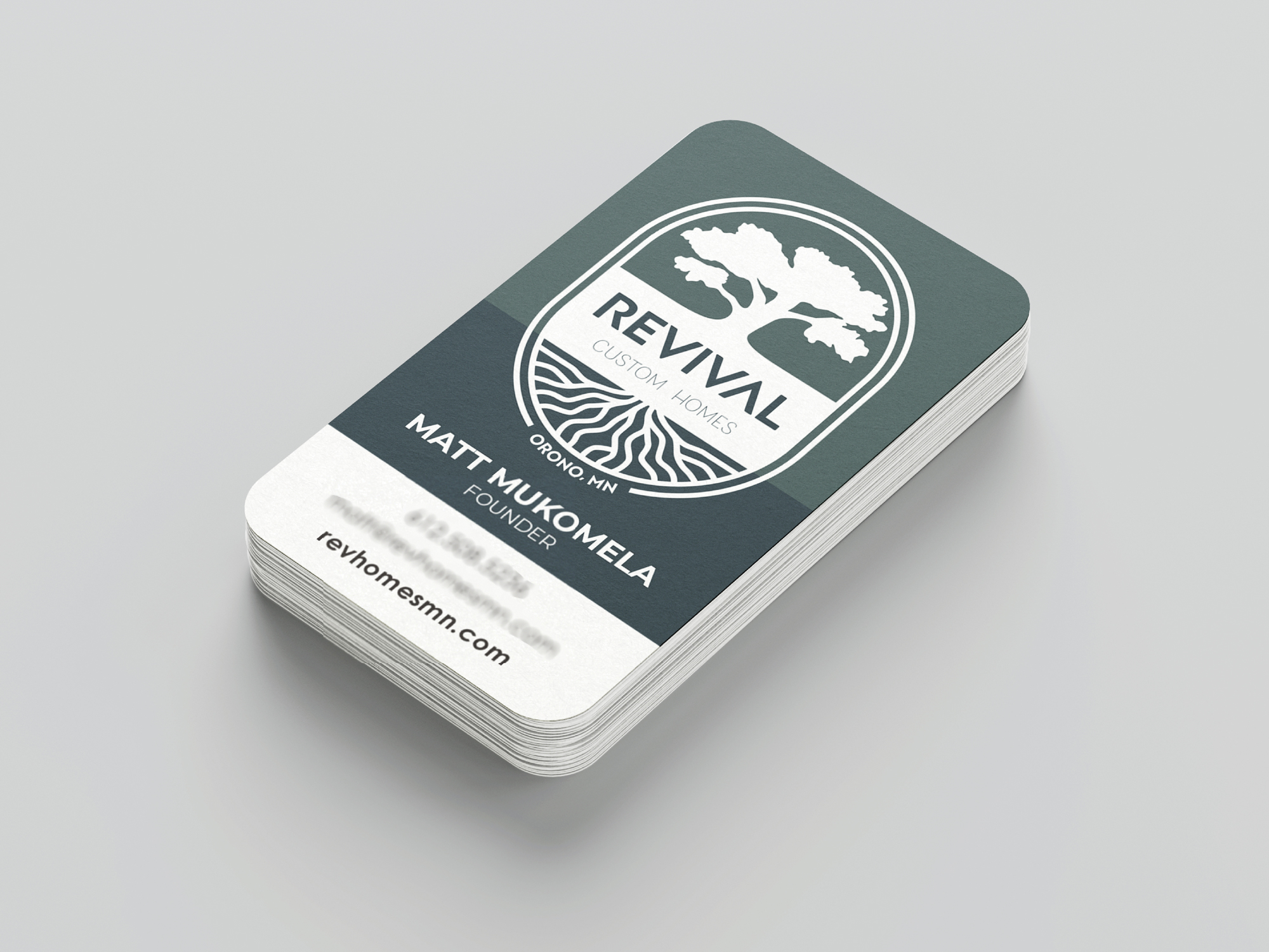
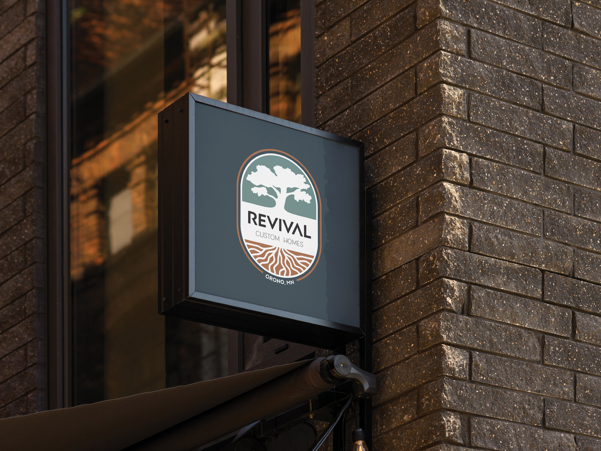
The final mark brings these ideas together through the image of an oak tree with exposed roots—a symbol of strength, stability, and longevity. The oak represents the enduring quality of each home, while the roots reflect the company’s deep connection to the community and its philosophy of building from a solid foundation.
Color Palette
The brand’s color system is inspired by natural materials and the landscapes surrounding Orono—creating a palette that feels warm, refined, and intentional.
• Navy – trust, confidence, and architectural precision.
• Slate Gray – balance, craftsmanship, and structural clarity.
• Slate Green – harmony, renewal, and connection to nature.
• Brown – warmth, reliability, and the grounded feel of natural woods.
• Tan – simplicity, approachability, and a sense of ease.
Together, these tones form a palette that feels elevated yet welcoming, echoing the character of the homes the brand creates.
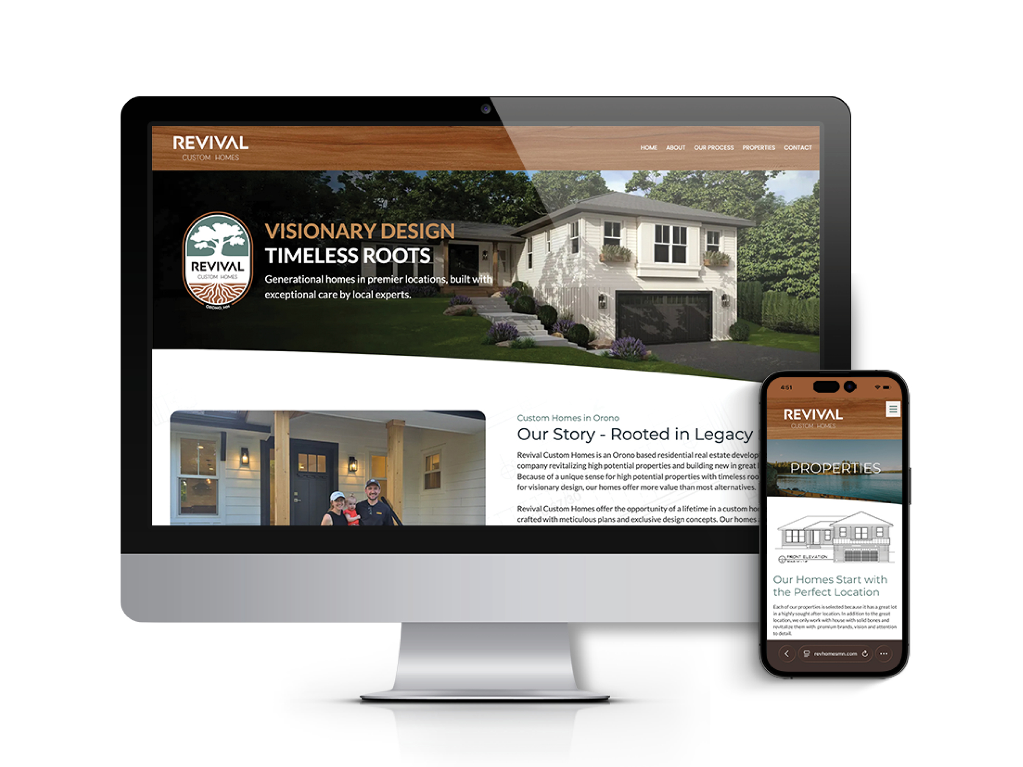
Website Design
The Revival Custom Homes website extends the brand identity into a refined digital experience that reflects the company’s focus on craftsmanship, quality, and sense of place. The design emphasizes simplicity and elegance, allowing the homes, architectural details, and surrounding landscapes to take center stage.
Clean layouts, generous imagery, and restrained typography create a modern yet timeless aesthetic that aligns with the character of the brand. The site is structured to clearly communicate Revival’s approach to homebuilding, highlight available properties, and introduce prospective homeowners to the company’s philosophy of thoughtful design and lasting value.
The result is a website that not only showcases the homes themselves, but reinforces Revival Custom Homes’ position as a builder dedicated to creating distinctive residences rooted in community and built for generations.