
Cetra Partners Property Management
BACKGROUND
Following a rebrand of its parent company, Cetra Partners Property Management needed to refresh its visual identity to align with the new brand while maintaining a distinct look and feel for its division.
STRATEGY
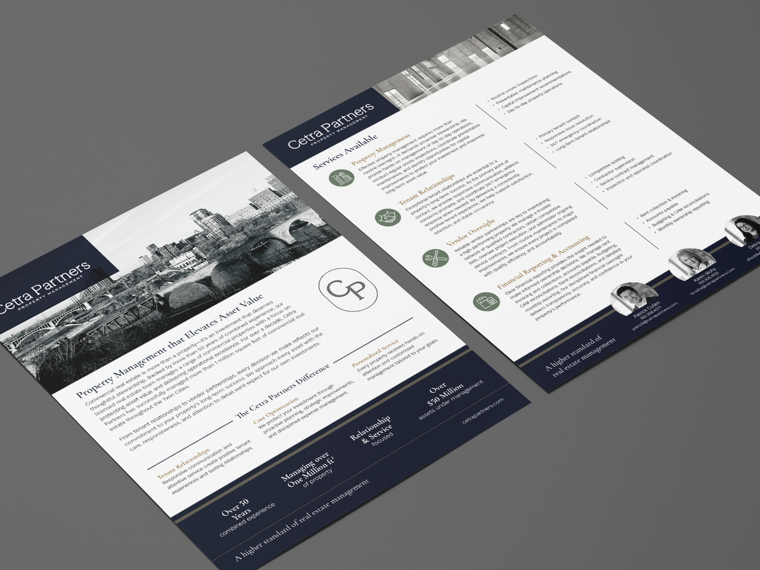
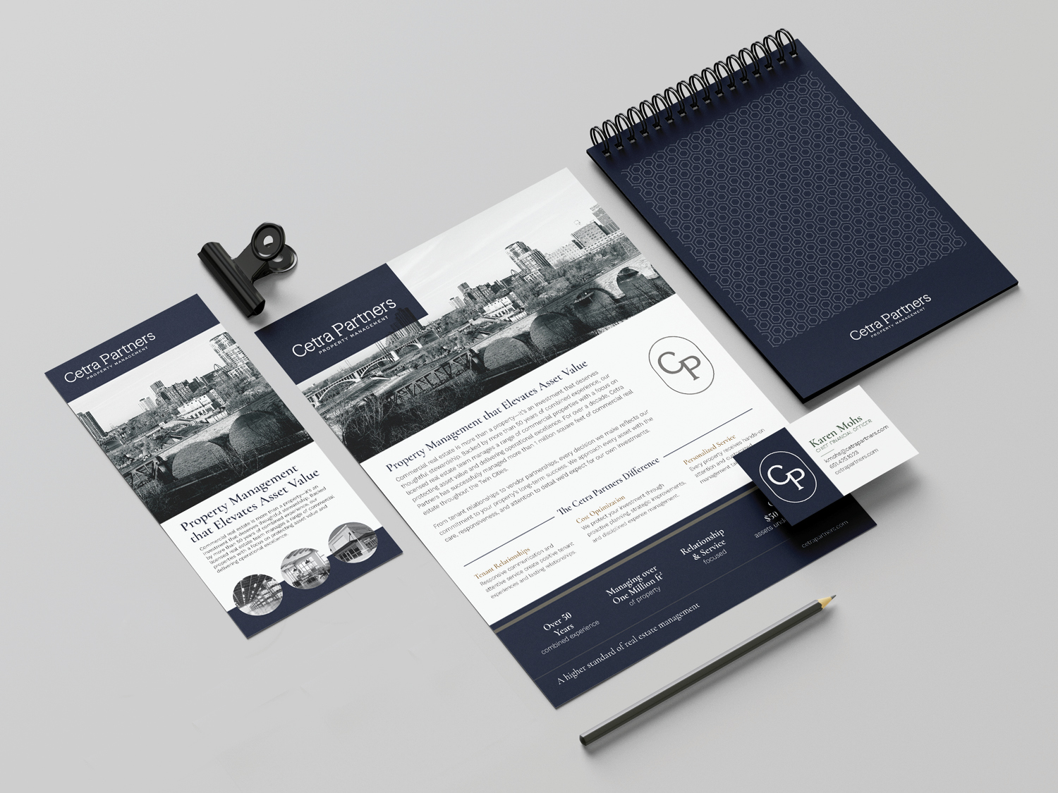
The design balanced the client’s preference for navy as the primary color with the need to connect visually to the parent company. Accent colors from the parent brand were incorporated throughout the materials to create a cohesive look while preserving Cetra Partners Property Management’s distinct identity. The overview sheet extended that approach to the messaging, with copywriting focused on highlighting the division’s unique strengths and differentiating it from competitors.
RESULTS
The refreshed materials established a cohesive, professional brand presence that connected Cetra Partners Property Management to its parent company while maintaining its own identity. From the overview sheet to everyday stationery, each piece reinforced a consistent look and communicated the division’s unique value.