
Branding Automations for good
BACKGROUND
Automations for Good helps mission-driven nonprofits use automation to simplify processes, improve efficiency, and create more time and resources for the work that matters most. The brand needed a visual identity that communicates the power of technology while reflecting the purpose, growth, and positive impact at the heart of the organizations it serves.
Logo Concept Development
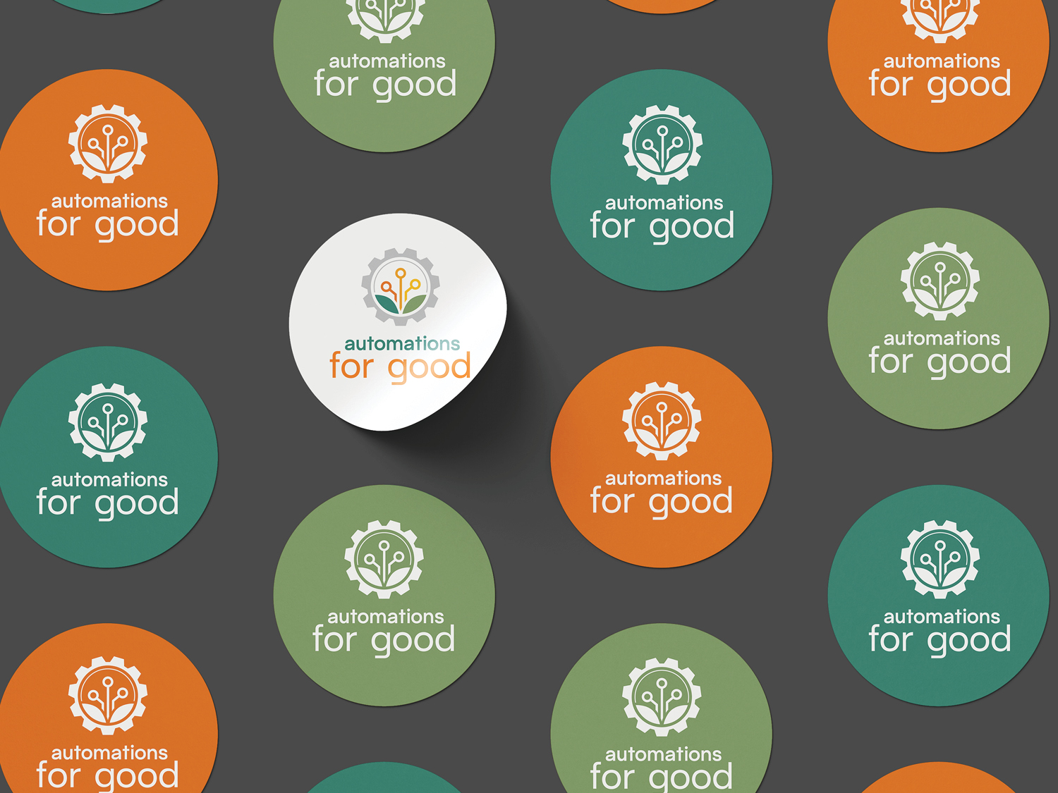
The logo brings together elements of technology and nature to represent the potential for automation to help mission-driven organizations grow and thrive. Data nodes form flower-like shapes, with leaves extending below them to suggest growth, connection, and new possibilities. A surrounding gear anchors the design in the technical systems and processes that make automation possible.
Together, these elements create a visual connection between digital innovation and organic growth, reflecting the idea that the work Automations For Good does can do more than improve efficiency. For nonprofits working to make a difference, automation can help create more capacity for their mission and the people they serve.
Color Palette
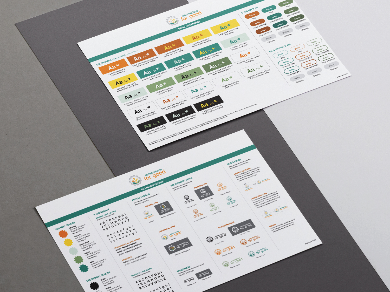
The color palette balances the energy of technology with the warmth of growth and human connection. Vibrant orange and yellow bring optimism and momentum, while greens and teals introduce a sense of balance, progress, and approachability.
Together, the colors create a flexible visual identity that feels modern and energetic while reinforcing the connection between technology, growth, and positive change.